
Last updated: September 2026.
Web design trends in 2026 come down to four forces: AI taking over production work, buyers expecting faster and more accessible pages, 3D and motion becoming standard rather than novel, and typography carrying more of the brand than stock imagery. DigiFix designs and rebuilds websites for Melbourne businesses, and these ten trends are the ones clients are actually asking us to implement this year.
DigiFix implements the trends that change how a page performs, not only how it looks.
In text, the three figures are these. The median mobile home page now weighs 2,164 KB, according to the HTTP Archive Web Almanac 2025. WebAIM’s February 2026 analysis of one million home pages found 95.9% had detectable WCAG 2 accessibility failures. Figma’s State of the Designer 2026 survey of 906 designers found 72% use generative AI in their workflow. Performance and accessibility are the two figures a business can act on this quarter.
- Accessibility remains the largest unresolved problem on the web. WebAIM’s February 2026 Million analysis found an average of 56.1 detectable errors per home page.
- Page weight keeps rising. The median mobile home page grew 202% over the past decade to 2,164 KB.
- AI is inside the design workflow, not beside it. 72% of the designers Figma surveyed in 2026 use generative AI for production work.
- Most trends are optional. Speed, clarity, contrast and a visible path to contact are the four things that reliably affect enquiries.
- DigiFix tests every trend against one question. Does it help a buyer understand or trust the business faster?
Planning a rebuild this year? DigiFix designs and rebuilds websites for Melbourne businesses from our office in Clayton.
See how our web design services work.
What are the ten biggest web design trends in 2026?
The ten trends below are the ones DigiFix sees in client briefs and in the sites that rank for commercial searches. They fall into three groups: visual direction (3D, bold typography, dark mode, motion, maximalism), structure (navigation, AI chat assistants) and engineering (accessibility, mobile performance, sustainable design). The engineering group matters most, because those three affect enquiries directly.
| Trend | What a visitor sees | Effort to add | Suits |
|---|---|---|---|
| 3D and immersive elements | A product you can rotate or explore | High | Product and property businesses |
| Bold typography | Oversized headings as the main visual | Low | Almost every service business |
| Dark mode | Near-black interface with light text | Medium | Tech, legal and premium brands |
| Motion and micro-interactions | Buttons and cards that respond to input | Medium | Any site with forms or long pages |
| Experimental navigation | Overlay menus or scroll-driven journeys | Medium | Small sites with few pages |
| Maximalism | Dense layout, vivid colour, texture | Medium | Hospitality, retail and creative brands |
| AI chat assistants | A chat window that answers questions | Medium | Clinics and trades with repeat questions |
| Accessibility-first design | Readable contrast, labelled forms, keyboard use | Low to medium | Every business, and required for many |
| Mobile-first performance | Pages that appear in under two seconds | Medium | Any site with mobile traffic |
| Sustainable web design | Light pages, system fonts, less video | Low | Businesses with an environmental story |
Not sure which of these is worth doing on your site?
Most Melbourne businesses DigiFix audits have the basics half finished. We will tell you which half, and what to fix first.
Why is 3D and immersive design showing up on more websites?
A 3D web experience is a page that renders an object or an environment in the browser in real time, so a visitor can rotate, zoom into or walk through a product instead of looking at a photograph. The technology behind it is WebGL, and modern browsers run it without a plugin.
For a Melbourne furniture, joinery or equipment business, a 3D view answers the question that usually costs a phone call: will it fit, and what does it look like from the side? DigiFix has used 3D on product pages where the object is the offer, and it earns its place there. The second and cheaper use of 3D is rendered illustration in place of stock photography, which gives a small brand a look that no competitor can buy from the same image library.
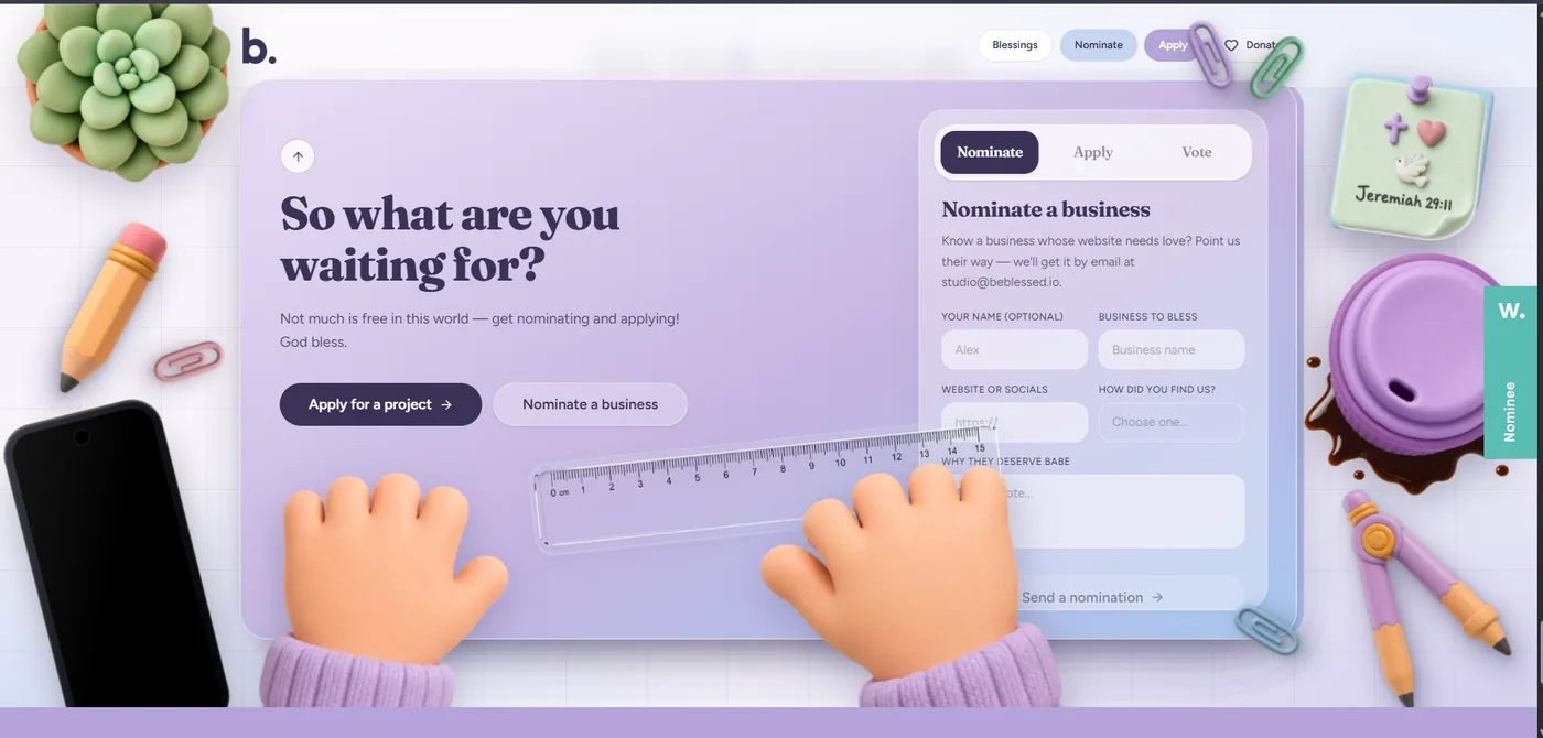
Example: Be Blessed (beblessed.io) using 3D rendered illustration instead of stock photography.
The risk is cost, and it is paid by every visitor on a phone. Real-time rendering uses processor time and bytes. Load the 3D element only where it answers a real question, give it a still image fallback, and never let it delay the text a buyer came to read.
How is bold typography changing page layouts?
Bold typography means using oversized, high-contrast headings as the primary visual of a page rather than decorating it with stock photography. In practice that is a headline set at 90 to 140 pixels on desktop, a short sentence underneath, and one action.
Bold typography is one of the cheapest trends to adopt and the easiest to get wrong. Text is the lightest asset a page can load, so a headline-led design usually beats a hero image on speed, and it stays readable when a visitor is standing in a car park on a phone. It also forces a business to say what it does in one line, which is the same discipline an answer engine rewards.

Example: MWDT, a precision manufacturer, using oversized uppercase headlines against product photography.
The risk is readability. Big headings next to long paragraphs fatigue a reader. DigiFix keeps body copy between 16 and 18 pixels with a line height of 1.6, holds paragraphs to four sentences, and checks the contrast ratio of every heading against its background before the page goes live.
Why are more business websites defaulting to dark mode?
Dark mode is a colour scheme where the page background is near-black and the text is light. A website can set dark mode as its only theme, or offer it as a visitor-selected option alongside a light theme.
Dark mode suits businesses that sell considered purchases and evening browsing, which is why legal firms, technology providers and premium product brands have moved to it. It can also reduce energy use on OLED screens, so it appears in sustainable design discussions as well.
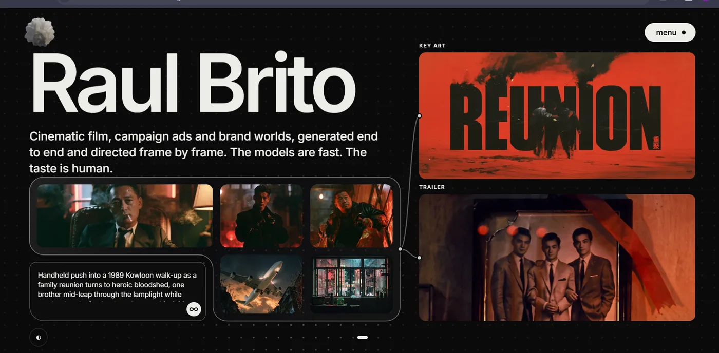
Example: the portfolio of film director Raul Brito, using a near-black interface with oversized type.
Dark mode is also where contrast fails most often, and low contrast text is the single most common accessibility failure WebAIM records in its annual Million analysis. Pure black backgrounds with pure white text produce halation on many screens. DigiFix uses a near-black such as #0B0B0F with off-white text, keeps body text at a contrast ratio of at least 4.5 to 1, and tests every colour combination rather than assuming it looks fine.
What do motion design and micro-interactions actually achieve?
A micro-interaction is a small animation that responds to something a visitor does, such as a button that fills on hover, a form field that confirms a valid email address, or a card that lifts as it scrolls into view. Motion design is the larger discipline around it: how a page moves as a visitor travels down it.
The value of both is feedback. A visitor who clicks a button and sees it respond knows the click registered, and a form that confirms each field as it is completed produces fewer abandoned enquiries. Baymard Institute’s checkout usability research, which has tracked cart abandonment for 14 years, puts the global average at 70.19% (Baymard Institute checkout research), and much of that loss happens at the point where a form stops responding clearly. Motion also makes a long page easier to follow, because it signals that new content has arrived.
Motion now has a measured performance cost as well as a visual one. Google’s Core Web Vitals include a responsiveness metric called Interaction to Next Paint, which records how long a page takes to visibly react to a tap or a click. Animation that stutters on a mid-range Android phone is a measured problem, not a matter of taste. DigiFix animates with CSS transforms and opacity, keeps the heaviest effects off the critical path, and honours the system setting for reduced motion.
Is experimental navigation worth the usability risk?
Experimental navigation replaces the standard horizontal menu with something less conventional: a full-screen overlay, a side rail, scroll-driven sections, or a search-style command palette that opens with a keyboard shortcut.
Done well, it makes a small website feel considered and gives a brand a distinctive entrance. It works best where there are few places to go and one obvious destination, such as an event page, a portfolio or a single-product site.
The risk is enquiries. If a visitor cannot see how to reach Services or Contact within a couple of seconds, the design has cost the business money regardless of how it looks in a portfolio. DigiFix keeps a visible link to the contact page on every screen, writes menu labels in the words customers use rather than internal project names, and tests navigation with a phone in one hand rather than a trackpad.
Where does maximalism fit next to minimalism?
Maximalism is the deliberate use of dense layout, vivid colour, layered imagery and texture, in contrast to the white space and restraint of minimalism. For most of the last decade minimalism was the safer choice. In 2026 both are live, and the decision is about what the brand needs to be remembered for.
Maximalism suits hospitality, retail and creative businesses whose value is personality. A restaurant that looks like every other restaurant website is competing on price. A site with a strong visual identity gives people something to describe when they recommend it.
The risks are weight and hierarchy. Layered imagery is the heaviest thing a page can carry, and the median mobile home page weight the HTTP Archive measured for 2025 was already 2,164 KB. DigiFix keeps one clear visual hierarchy inside a maximalist design: one dominant element per screen, consistent navigation, and images compressed and served in a modern format so the personality does not arrive at the cost of a slow page.
How are AI chat assistants changing website conversion?
An AI chat assistant on a website is a conversational agent that answers a visitor’s question in natural language and passes the conversation to a person when the question falls outside what it has been trained on. It is different from the scripted chat widgets of the last decade, which could only follow a decision tree.
The trend is not the widget. It is that the assistant is now designed as part of the interface, with as much attention given to what it says as to where it sits. For a Melbourne clinic or trades business, most after-hours enquiries are variations of five questions, and an assistant that answers them keeps the enquiry on the website.
The risk is confident errors. An assistant that invents a price, a stock level or an appointment time damages trust faster than no assistant at all. DigiFix scopes assistants to a defined set of questions, sources the answers from the business rather than the open internet, and always shows how to reach a person.
Why is accessibility now a design trend rather than a compliance task?
Web accessibility is the practice of building pages that people with disabilities can use, covering contrast, keyboard navigation, form labels, alternative text for images and the order of headings. It has moved from a compliance checklist to a design trend because the same fixes also make a site easier for everyone to read on a phone.
WebAIM’s February 2026 analysis of one million home pages found 95.9% had detectable WCAG 2 failures, an average of 56.1 errors per page (WebAIM Million 2026). The most common failures were low contrast text, missing alternative text for images, unlabelled form fields and empty links.
Two audiences benefit. A screen reader needs an image described in words, and so does an answer engine deciding what the page is about. Labelled form fields help a screen reader user finish an enquiry and tell a machine what the form collects. Australian businesses also carry obligations under the Disability Discrimination Act, which is the argument that settles the conversation when budget is tight.
How does mobile-first performance shape design decisions?
Mobile-first performance means designing for the smallest, slowest device in the audience and treating the desktop version as the adaptation, not the other way around. Most local searches your customers make happen on a phone, often outdoors, on a mobile connection.
The numbers say the web is going the wrong way. HTTP Archive’s Web Almanac for 2025, published in January 2026, put the median mobile home page at 2,164 KB, a 202% increase over the past decade (HTTP Archive Web Almanac 2025). Most of that growth is imagery, third-party scripts and video.
Design decisions that keep the weight down are mostly choices not to add things. DigiFix serves images in modern formats at the size they are displayed, loads video only when a visitor asks for it, removes WordPress plugins that are not earning their bytes, and sets a page weight budget before the design starts. A practical checklist for the same work is in the website redesign checklist DigiFix uses with clients.
What does sustainable web design mean in practice?
Sustainable web design is the practice of building pages that use less energy, which in most cases means sending fewer bytes. A web page is delivered by data centres, networks and a device that all draw power, and the size of the page is the part a business controls directly.
The practical steps overlap almost completely with performance work: use system fonts instead of loading four weights of a web font, prefer vector graphics and type over large photographs, compress images properly, cache static files, and check whether the hosting provider publishes its energy source.
This is the trend DigiFix recommends most often to businesses with an environmental story to tell, because the claim is verifiable. Anyone can measure a page’s weight and carbon estimate, so a sustainability sentence on a home page can be backed by evidence rather than intention, and the same work makes the site faster for customers.
What does a redesign look like for a Melbourne business?
Consider a restaurant in Clayton with a site built in 2018. It looks reasonable on a desktop, takes close to five seconds to load on a phone, has a menu that only exists as a photograph of a printed page, and takes bookings by phone during service when nobody can answer.
Here is what DigiFix would do, in order, and how long each stage usually takes.
- Audit and plan (week 1). DigiFix measures the current site’s speed, accessibility failures, mobile layout and search visibility, and lists what is worth keeping.
- Content and words (weeks 1 to 2). The menu becomes real text, the booking question is answered on the page, and each service gets a clear one-line description.
- Design direction (weeks 2 to 3). Two visual directions are proposed against the content, not as empty mockups.
- Build the site (weeks 3 to 5). The site is built on WordPress with the rankings carried across and redirects for any changed URL.
- Accessibility and performance pass (week 5). Contrast, labels, alt text, keyboard navigation and page weight are checked before launch, not after.
- Launch and measure (week 6 onward). The new site goes live with analytics and enquiry tracking in place, so the next decision is based on data.
The cost of doing nothing is the phone that rings during service and goes unanswered, and the customer who reads a photograph of a menu on a phone they cannot zoom. Those are lost bookings that never appear in any report. The same sequence of work for hospitality businesses is described on the DigiFix custom UX design page for Melbourne restaurants.
How do you choose which trends to use?
Run every trend through five questions before it reaches a design file. DigiFix uses these on client projects, and most trends fail at least one of them for most businesses.
- Does it help a buyer decide faster? A trend that adds a step between a visitor and an enquiry needs a strong reason.
- Does it survive a mid-range phone on mobile data? Any effect that stalls the page on a slow connection is costing more than it adds.
- Can your team maintain it? A design the business cannot update without a developer becomes an outdated website within a year.
- Does it pass contrast and keyboard checks? Accessibility is not a separate project, and it cannot be retrofitted cheaply later.
- Would it still be defensible in 18 months? Trends that only exist as a visual effect date quickly. Trends that improve speed, clarity or accessibility do not.
Adopting a trend because a competitor has one is the most common reason a redesign underperforms. The narrower question is: which single change helps a first-time visitor understand what you sell and how to buy it? For more on how DigiFix approaches that work in Melbourne, see about DigiFix.
Want to see this applied to real Melbourne businesses?
Our portfolio shows the sites DigiFix has designed and rebuilt, with the problem each one solved.
What do Melbourne businesses ask about web design trends?
What are the top web design trends for 2026?
The ten trends used most in 2026 are 3D and immersive elements, bold typography, dark mode, motion and micro-interactions, experimental navigation, maximalism, AI chat assistants, accessibility-first design, mobile-first performance and sustainable web design. Accessibility and performance affect enquiries most directly, because they decide whether a visitor can read the page and reach the contact details.
Are web design trends worth following for a small business?
Only the trends that make the business easier to buy from. Speed, readable contrast, labelled forms, clear navigation and a visible contact action are worth following for every small business, because each one removes a reason for a customer to leave. Visual trends such as maximalism, dark mode or experimental navigation are choices about brand personality, and they are optional.
How much does a website redesign cost in Melbourne?
The cost depends on four things: the number of pages, whether the design is custom or based on an existing theme, how much content has to be written or rewritten, and which integrations are needed, such as bookings, payments or a customer relationship management system. DigiFix quotes after a scope conversation, because a five-page service site and a twenty-page online store are different projects even when the design looks similar.
How long does a website redesign take?
A small business site in Melbourne usually takes four to six weeks from kickoff to launch. The variable is content: a project where copy and images are ready moves at the pace of design and build, while a project where every service page has to be written from scratch takes longer. DigiFix builds the accessibility and performance checks into that timeline rather than adding them afterwards.
Do I need dark mode on my website?
No business needs dark mode, and it is a poor fit for sites where visitors read long passages of text in daylight. It suits technology, legal and premium product brands that want a considered, evening-browsing feel. If you do adopt it, the deciding factor is contrast: every text and background pairing has to reach a contrast ratio of at least 4.5 to 1 for body copy, and that check has to be run rather than assumed.
Will AI tools design my website for me?
AI tools do the production work already. Figma’s State of the Designer 2026 survey of 906 designers found 72% now use generative AI in their workflow (Figma State of the Designer 2026), mostly for first drafts, layout variations and repetitive tasks. What AI does not do is decide what the business should say, which page a customer needs first, or whether a design is accessible. Those decisions still come from understanding the business and its customers.
How do I make my website accessible without a full redesign?
Start with the four failures WebAIM records most often: low contrast text, missing alternative text on images, unlabelled form fields and empty links. Each can be fixed inside an existing design, and the fixes are usually content and settings changes rather than a rebuild. Fixing contrast and labels first gives the largest improvement for the least work, and it also helps search engines and AI answer engines understand the page.
Which trends should DigiFix implement on your site?
Usually two or three of the ten, not all of them, chosen against what your customers ask before they buy and what your current site makes difficult. More worked examples on speed, content and local search are on the DigiFix blog.
Get a clear answer on what to fix first
Book a free consultation with DigiFix. No obligation, no lock-in contract, and you will leave the call knowing exactly where your website stands and which of these trends is worth your budget.
DigiFix, Unit A11/2A Westall Rd, Clayton VIC 3168. Serving businesses across Melbourne.
Do you want more traffic?
—————
Hi, we are an Australian digital agency doing groundbreaking work to help a business like yours reach its full potential. My only question is will you qualify for our services?
Do you want more traffic?
—————
Hi, we are an Australian digital agency doing groundbreaking work to help a business like yours reach its full potential. My only question is will you qualify for our services?