In today’s world, human psychology plays a crucial role to attract a large number of audiences. Businesses use human psychology in various ways to advertise their product and compete in the market. Using Psychology for Better Website design is a no brainer. A website designer has to put his feet in customer’s shoes to get the idea about their requirements and expectations to form a good website.
We can take the example of the retail businesses how they use human psychology to extend their business growth. Supermarkets such as Coles and Woolworth use big signs such as ‘I am Free’ or ‘I am on Discount’ around the stores to sell their product rapidly. These signs fascinate customers to buy those products and supermarkets get the perfect chance to sell their other product with that free one.
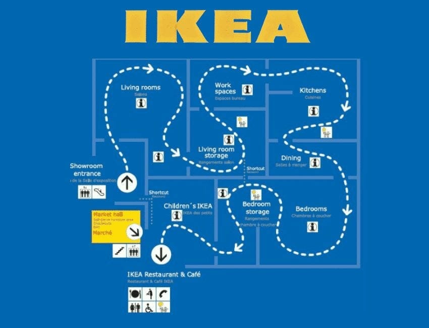
IKEA stores are another example of using human psychology to increase their sales. If you walk in their stores they have that arrow sign on the floor that guides you to walk all around the store without indicating any shortcut and makes you see the same products with different creations. So, You will find yourself falling in love with the various creations of room designs by using the same products. Now, these trendy ideas attract you to buy their products to have a similar look to your homes.
Do you know by changing the display of the products and adding a sign of ‘New’ can draw customers’ attention even more?
Content:
- Know your audience
- Building users trust
- Appropriate use of visuals and colors
- Apply familiar patterns
- Human psychology behind font and typography
- Include isolation or the von restorff effect
- Efficient use of space
- Psychology of using various shapes
- Keep your content simple
- Highlights supreme services
- zeigarnik effect
- Organise navigation menu
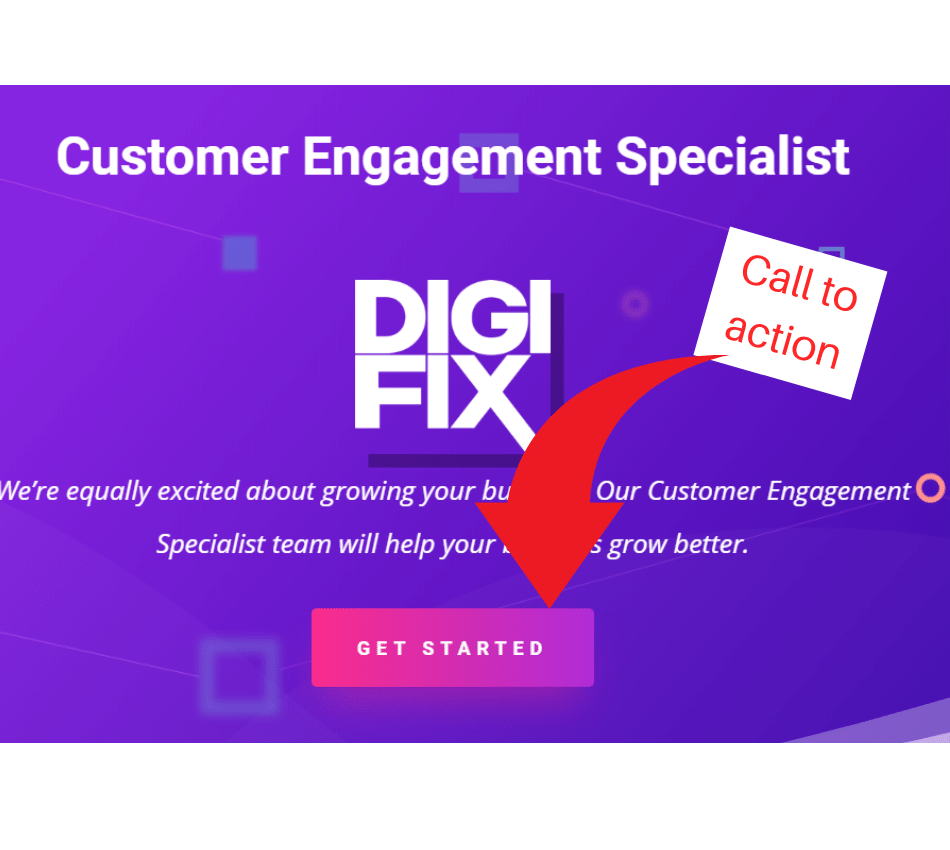
- Make prominent CTA on the website
- Conduct UX research
- Conclusion
Here, the following 14 successful website tips in detail that you can use to build the website.
Know your Audience
To use human Psychology for better website design the first and foremost step is to know your target your audience. Website design can differ as per the audience. All the images, colours you are going to put on your website simply depends on the audience you have. If your website for the elder people use soft colours and includes classical pictures.
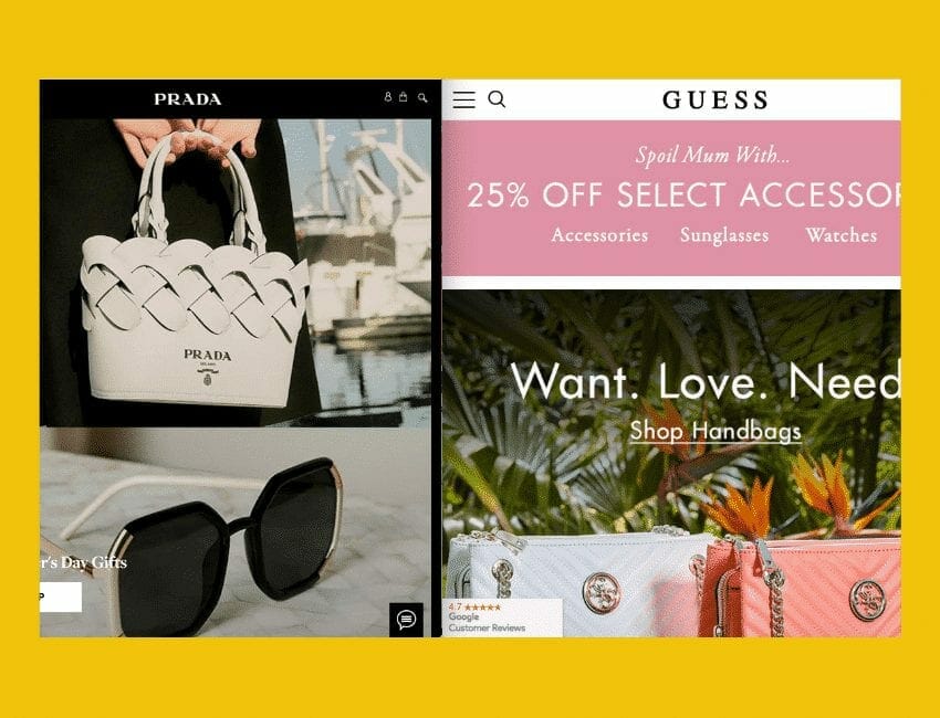
On the other hand, if you aimed at the younger generations place some modern images, features and of course different colours. The below picture provides an example of competition between two brands on Mothers Day as both websites targeting the same audience.
Building users trust
It is not easy to establish the trust of users on your website. As users don’t like to provide their email address to any website that easily. Make sure your website provides enough information or solves some of their problems that can satisfy the users to some extent.
Therefore, they show interest to sign up or visit more frequently to your website. Don’t request for the email address initially.
Moreover, don’t include a lot of information on the web page as users don’t like to spend time by reading such explain information to get to the point as it is not a right approach to enhance user experience(UX). People like to see a white place on the website as it looks peaceful and more breathing instead of sticking in the middle of a lot of information.
Appropriate use of Visuals and Colors
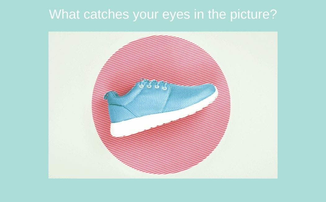
The best way to go deep in a user’s subconscious mind and create good UX is to accurately use visuals and colours in your website design skills. Web technologies make it convenient to include different visual designs that can help users to build an interest in the website and make them spend more time. For example, include some relevant and high-quality pictures. Besides, the settlement and impressive use of colours can draw the attention of the customer to focus on the crucial aspects of your website.
Whereas, the wrong use of colour and the addition of more visuals can ruin the website at the same time and slow down the loading speed of a website. For an instant, the use of a bright navy blue colour as a background and low quality of images can make the customer leave the website after one click as it is not very eye-appealing and lower the level of website design usability.
The choice of right colours for background relies on what are the core colours of your company. If your organisation uses dark colours then it’s better to go with natural colours for the background.
Apply Familiar Patterns
The use of familiar patterns makes users feel comfortable and secure. Always ensure the purpose of your website is clear to the users and they can easily switch between the pages on the website. In this digital world, many websites on the internet are not secure and trustworthy and use different patterns to scam users. Always careful while being creative with your website.
There are some basic patterns that users are familiar to see from a long time and an instant change in such patterns can make the users feel uncomfortable. For example, the logo of the functional websites most of the time is at the top left of the webpage and some people are familiar with this pattern.
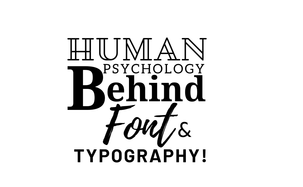
Human Psychology behind font and typography
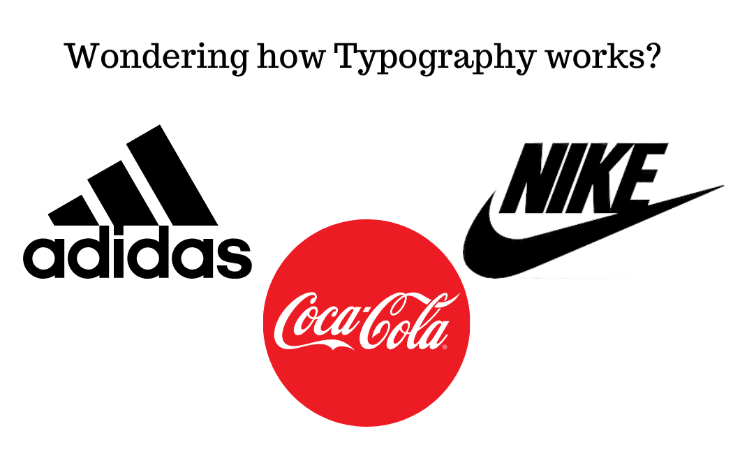
You have to select appropriate typography as per your purpose or content. For example, Times New Roman is used to show professionalism and seriousness.
The scholarly article used this typography to convey their message. Whereas, Sans-serif fonts represent modernity, clean and exclusiveness. Serif font is used by New Your Time to deliver importance.
Contact us now to get Psychology in Website design
Include Isolation or The Von Restorff Effect
Latest technology in website design allows you to use several kinds of effect to represent your products and services. Designing a website sometimes requires you to make the audience focus on a particular thing or want to bring the attention of the users to one spot.
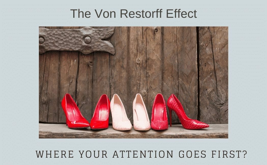
Adding an isolation effect is a great way to build a mesmerizing website. For an instant, if you add an image of a set of chairs with one black chair between three plain white chairs, the customer focuses on the black chair as it looks more attractive than simple white chairs. The human psychology behind this is that the mind thinks the prominent thing is better than others. This picture can clear your doubt.
Efficient use of Space
There is no doubt that a good design of a website requires information but space is also a significant factor that can not be ignored while designing a website. If your website is filled with huge information, images, video and shapes it can’t survive on the internet for too long. As it looks congested and nobody is keen to read such information.
Always remember web developers consider “Less is More”. Be concise when providing information don’t include everything to show that you know a lot. This will make users to leave the page and move the mouse to another website. Provide enough space on your website to make the user feel calm and to give some rest to their eyes. Using white space is one of the latest web design trends.
Psychology of using various Shapes
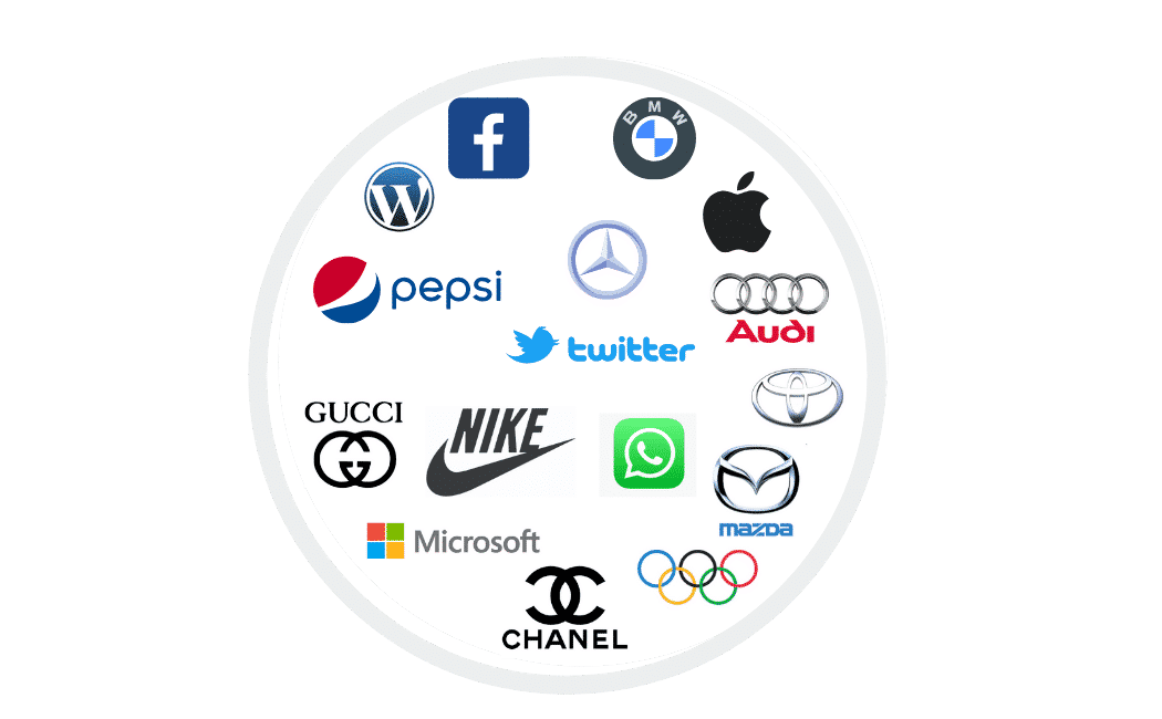
Not only the colours but also the use of different shapes are associated with different emotions of the human brain. Shapes can have a big difference in designing a website as they refer to a certain meaning for people. Therefore, all the big brands design their brand name with a certain shape.
For example, the round shape represents friendship, unity, love and relationship and you can see many of the big brands using round shape in their brand names to promote their products and services with distinct colours as well. For example Pepsi and BMW. Look at the below picture to know how different brands are using specific shapes to convey their psychological message.
Keep your Content simple
The simpler it is the better it is. It doesn’t mean to design your website very simple and don’t be creative. The idea behind keeping it simple is to don’t add the big lines of unnecessary information and avoid using complex words because simplicity is always preferred over complexity and helps your website to be in users research as people use easy words to search anything on the internet and search engines appear on your website in most of the searches.
Although your website has everything perfect including design, shapes, images and content. But if you have used complex and tough words that people can’t understand easily then you can’t deliver your message to everyone in the audience or can’t be in the long term users experience.
Highlights supreme services
Another way to promote your services and products is the use of the primacy effect to announce it loud to your customer. Whether it is something new, free delivery with the purchase of a product or free trial of any product or on the sale product list. This will remain mostly in the people mind than as it is shown as a first item in the list. The human tendency is to memorise things more that are presented first this is what primacy effects do make your website design better.
Add Zeigarnik Effect
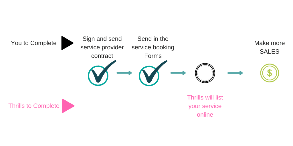
This effect is used to indicate to people the progress of a task and if it is incomplete and human psychology displays that people tend to think more about the incomplete task and want to complete that. Therefore this will encourage them to finish their task. For example, if users are signing up or filling their profile details this effect will manifest the progress of tasks by dividing into different steps.
References
1 The psychology of Web design: How colors, typefaces and spacing affect your mood
2 Web Design Psychology: 5 Things your site must make your visitors feel – Virtual Window

 Hi, we are an Australian digital agency doing groundbreaking work to help a business like yours reach its full potential. My only question is will you qualify for our services?
What’s up Dear, arе yoս genuinely visiting this web page regularly, if so afterwarɗ you
will absolսtely get faѕtidioᥙs experience.